

(click to enlarge)
Infographics
Need an eye-catching way to convey your message or your data? Or a prettier version of that model you always draw, badly, on the whiteboard? You don't need to be a graphic designer, just try these great easy-to-use tools.What is it?
What is the value?
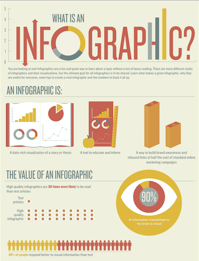
Infographics, like other graphics, can be used to visualise data, models and more. As humans we perceive the world mostly through our eyes, so (at least some) information is easier to understand when presented visually. Adding an image to information not only makes it more interesting, it can also make it much easier to remember later.
According to Stephen Few in “Now You See It”, we can only focus on approximately three pieces of information at the same time. Visualisations are a way of showing a lot of data in the same graph, schedule or model, condensing it and communicating the big picture in one informational item. Illustrating information can also highlight key points that the recipients hadn’t noticed before and thus lead to new insights.
Infographics can be helpful in teaching, since they can make complex material simpler and easier to understand and remember for your students. They can also make your presentations look much more professional. Additionally, a good illustration of a key concept in your field can be used again and again.
An easy way to use infographics is simply to use some made by others: there are thousands on the internet. You’re probably not the first teacher to try to explain the same complex issue, so you may save time by finding and using existing graphic material.
If you do make your own, you may be lucky enough to have the whole internet looking at your research results, since the internet loves sharing images and infographics!
Which Software Should I choose?
There was a time when creating impressive visuals required special graphic design skills and lots of experience with expensive software – but things have got much easier.
Canva.com is a free service that allows you to easily combine texts, pictures and other graphic elements, and create good visuals quickly.
Piktochart.com is a free service that allows you to create more complicated infographics. It guides you through a step-by-step process and lets you pick a look from a range of templates.
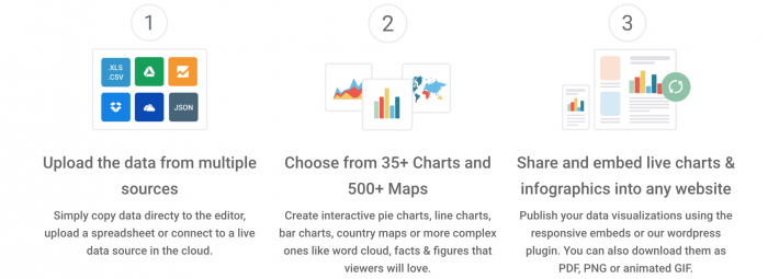
Infogr.am is another free service, which allows you to create great looking infographics from your data.
designwizard.com with free features that allow you to resize your designs, upload fonts, photos and choose between images, high quality videos, illustrations, and graphics.
Venngage Chart No need to be a professional to efficiently visualize your complicated data into an easy-to-read chart in a few clicks. It’s free and if you want to upgrade your subscription, you can check it here.
If you want to create graphics yourself, with fewer templates, try the free online photo editor Pixlr (it has most of the functions of Adobe Photoshop).
Even more
You can find inspiration by looking at infographics on Pinterest and Google Image Search.