1) A presentation is not (just) a slideshow
Your presentation is a visual aid to support your spoken points. There are two parts to an excellent presentation: the spoken words and the visual illustrations. Great presentations are often characterised by good interplay between the spoken parts and the visual aids.
2) Having no slides is better than a bad slideshow
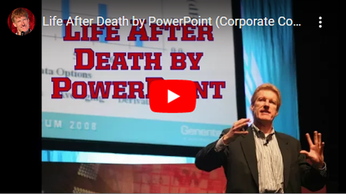
There is no rule saying you must have a PowerPoint presentation, so it’s always worth considering whether you actually need one. Maybe the spoken word will be stronger if you leave out the slides and the projector? For a good introduction to using slides better, you can watch this video, which demonstrates all the ways not to use presentations:
3) Learn to use “presentation mode” in your software
PowerPoint, Keynote and Google Slides all have a presentation mode that lets you see the current and next slide, the time and, most importantly, your notes. Meanwhile your audience is only shown your slides and never need to see a line of text. This leaves you free to really use the visual medium and show an actual presentation, not just to use it as your teleprompter!
4) The presentation should support your message
Think about what message you want to convey, not what slide to create next. Most presentation software is very linear, so it is often better to generate ideas and sort out your presentation’s storyline before you start making slides. (If you want something less linear for your presentations, use Prezi.
5) Make your presentations visual
Your audience cannot read a text and listen to you at the same time, so if you want them to read that great quote, make sure it’s legible and give them a moment to read it. Pictures, however, can support your speech and help your audience remember the material you cover, so use photographs, sketches, drawings, models and visualisations! Special effects have a bad reputation for bouncing words meaninglessly around, but used right, an effect can be a great way to get your point across. You should to create memory anchors to help your audience remember the key points – and a picture often does that much better than a thousand bullet points.
6) You can use pictures legally in teaching
While teaching at the University of Copenhagen you are covered by the Copydan Visual Arts agreement on photos and video. This means you are allowed to use most resources in the classroom and on Absalon, and Copydan will clear the rights. If you are planning on making your presentation public to a greater audience, recording it or if you need to show works of art, see below.
7) There are lots of free photos you can use legally anywhere
Find great pictures, videos, drawings and sketches to use in your presentation – just look for material published under a Creative Commons License. Creative Commons is a way to publish your work and allow others to use it and sometimes even change and incorporate it into new works. Many people post their work online, and you can use it legally as long as you credit them (by naming them and linking back to the work). Use Creative Commons’ own search page to find all kinds of material published under a CC license, or start by checking out all the beautiful photos on Flickr.com published under a CC license.
8) Invest time in producing re-usable material
 That model or formula you draw badly on the whiteboard every time you teach the same material? Why not make it properly once and for all so you can reuse it every time (and maybe publish it under a CC license so others can use it?). A quick way to make a graphic using drag and drop is Canva.com – or maybe someone else has made it already and made it available on the web?
9) Avoid death By PowerPoint
Don’t do it!


